NEWS
TUX named one of Adweek’s Fastest Growing Agencies[ Close ] 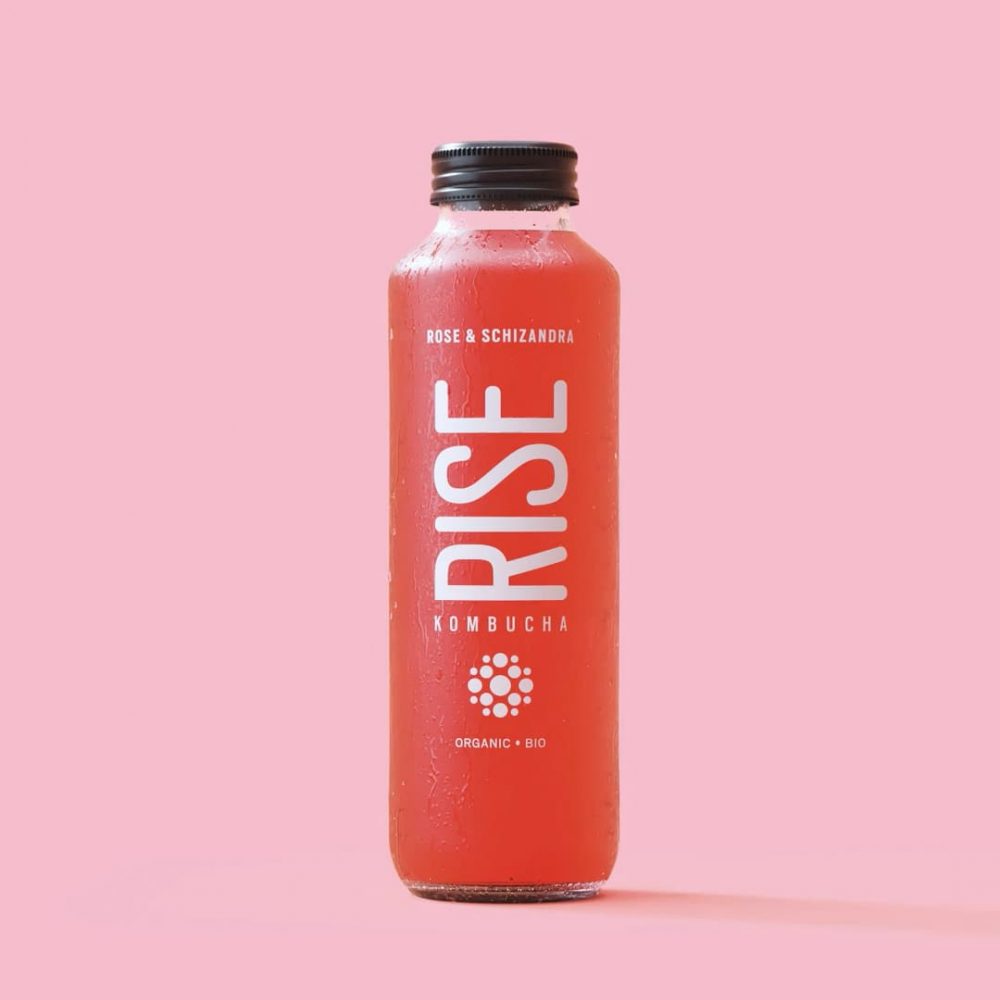
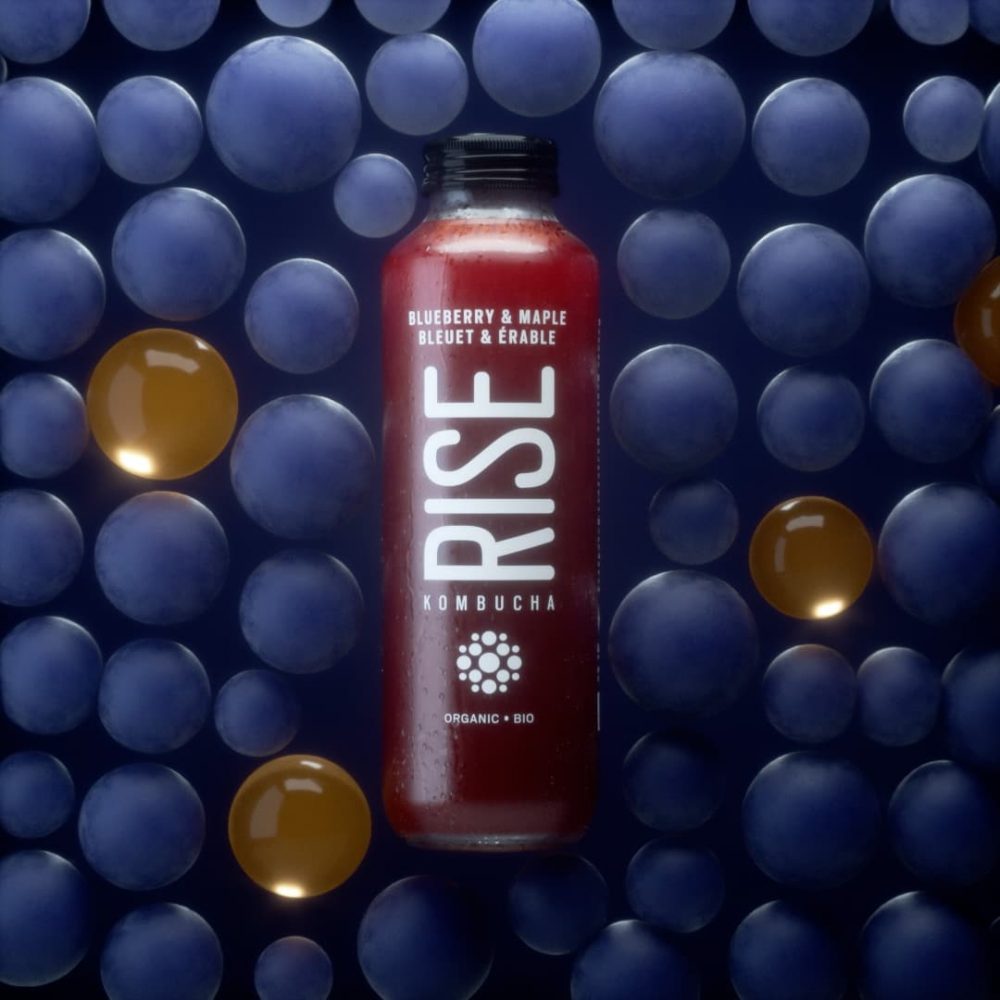
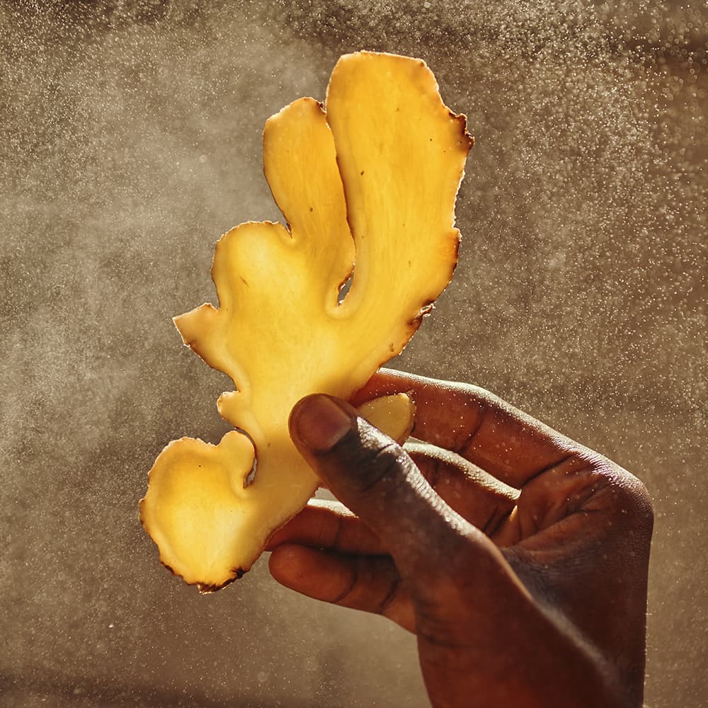
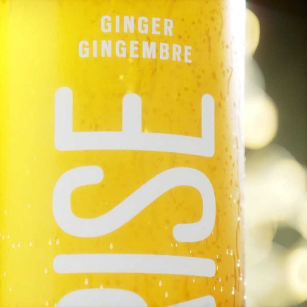

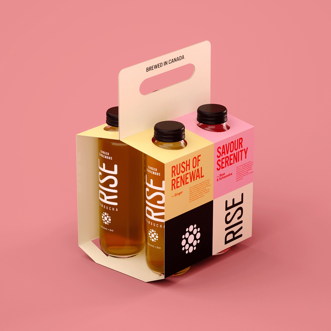
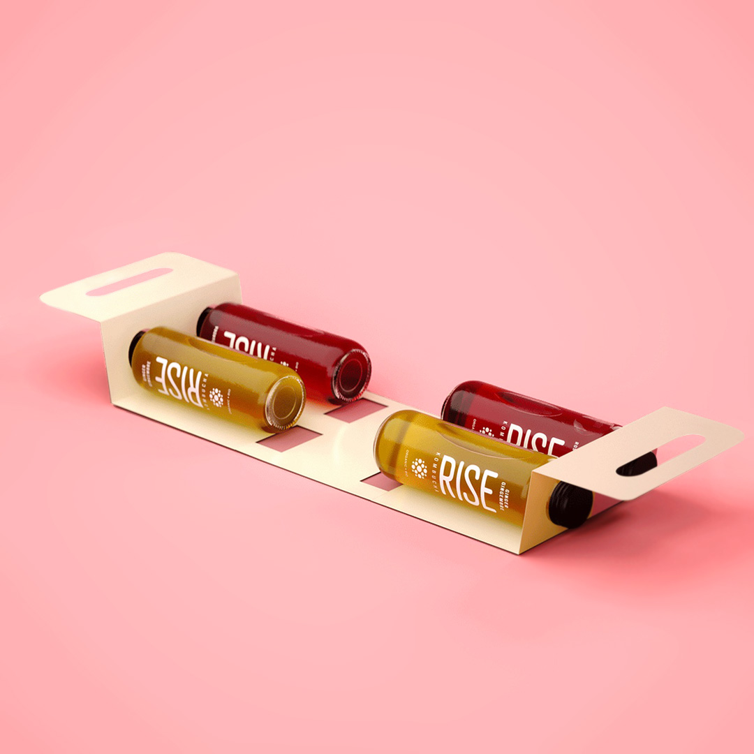
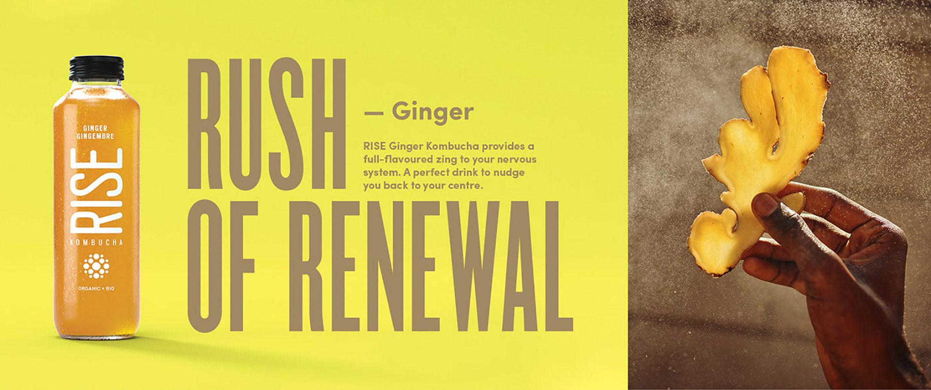


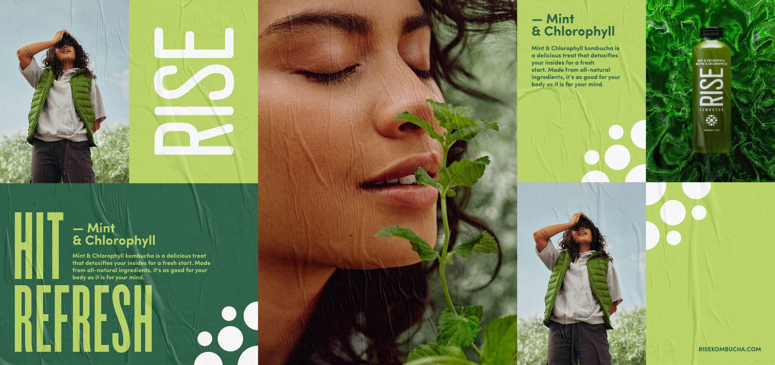
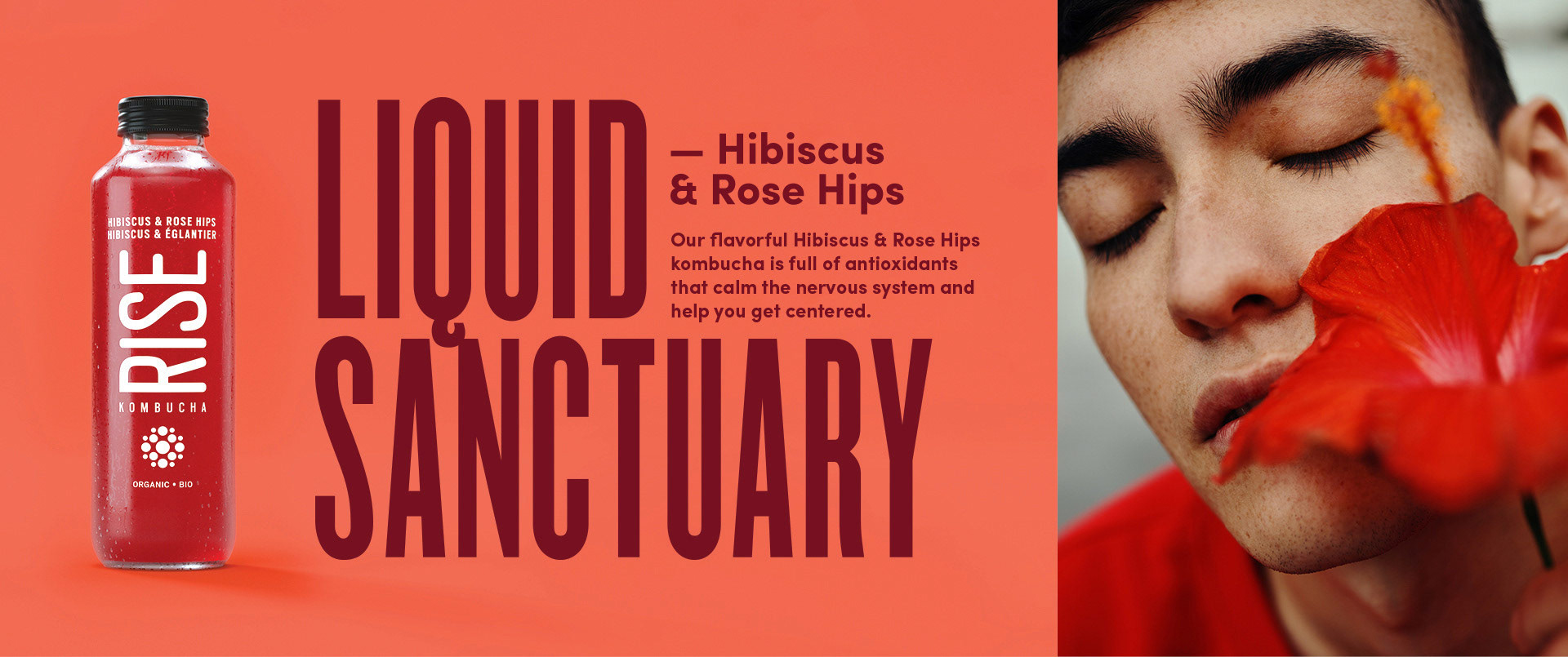

Rise Kombucha
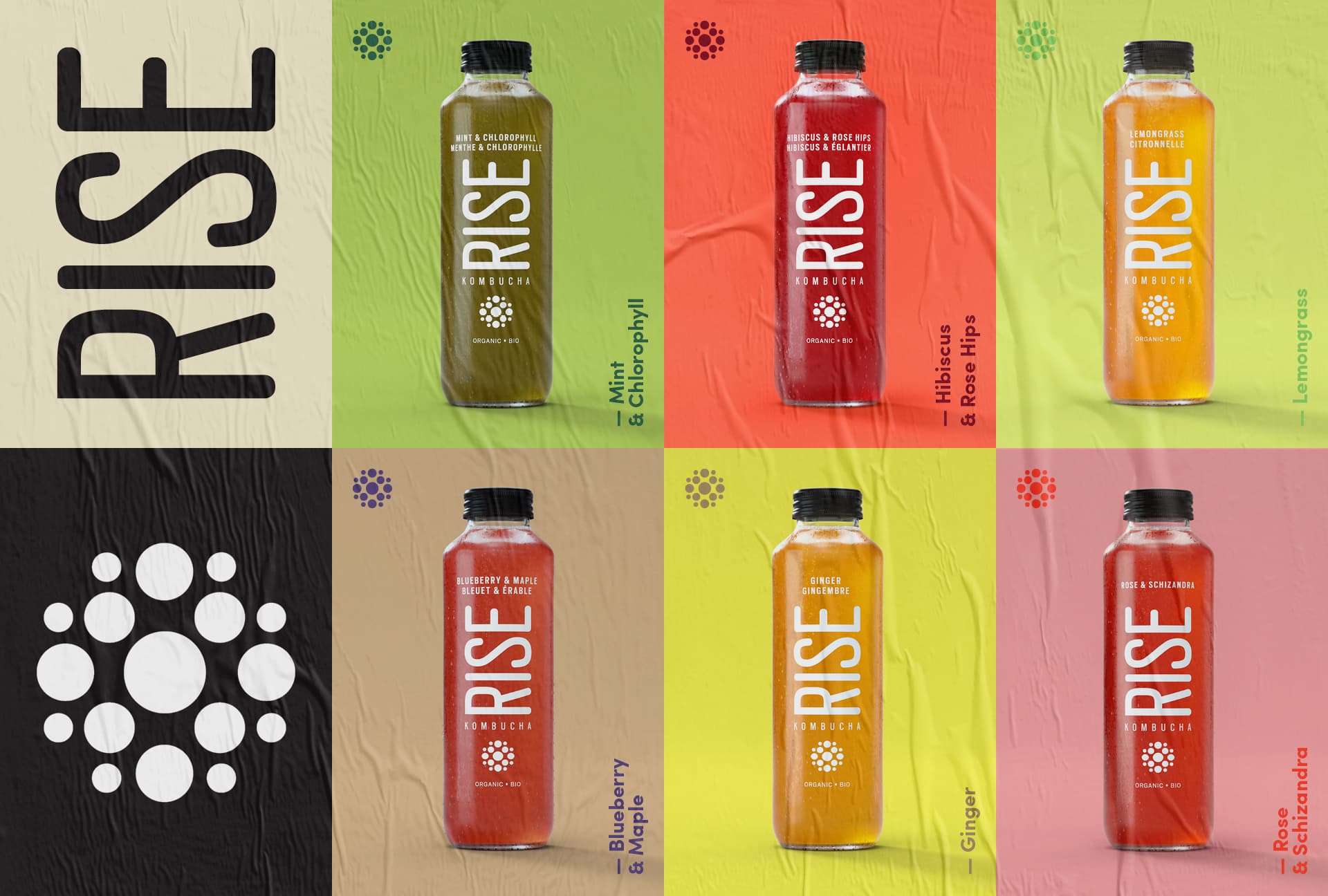
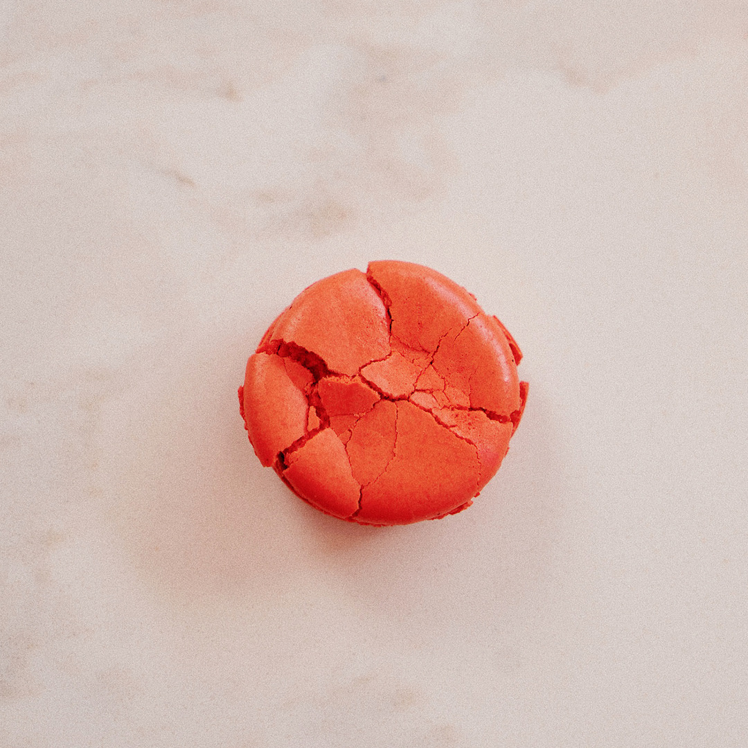
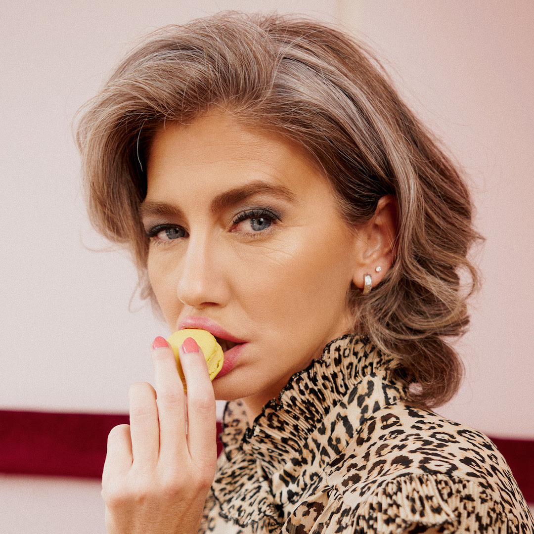
RISE, the leading kombucha brand in Canada, is known for its “good-tasting” products. In 2016, when they called on TUX in 2016 for their launch in the U.S. market, most competitive brands relied on health benefits to get consumers’ interest. To differentiate RISE and spark discovery, we presented the brand as a mindful indulgence by visually expressing the effects of its flavours on people’s mood and feelings. Tell me more
Next slide
Rise is Canada’s #1 kombucha (with 35% of market shares). As the brand was looking to expand into US distribution, it contacted us to strengthen its brand platform.
Mandate
Our mandate was to weave the existing assets such as the logo and emblematic bottle into a more comprehensive brand system and communication approach that would give Rise a unique and ownable voice as it entered the US market. The objective was to increase awareness, provoke brand discovery and consideration.
Unlike the Canadian market, the US landscape was already conquered by big players with deeper pockets and wider distribution. So how do you measure up?
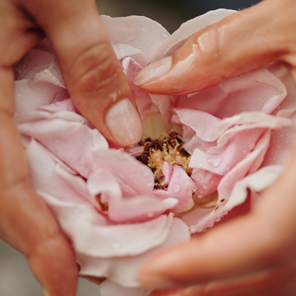
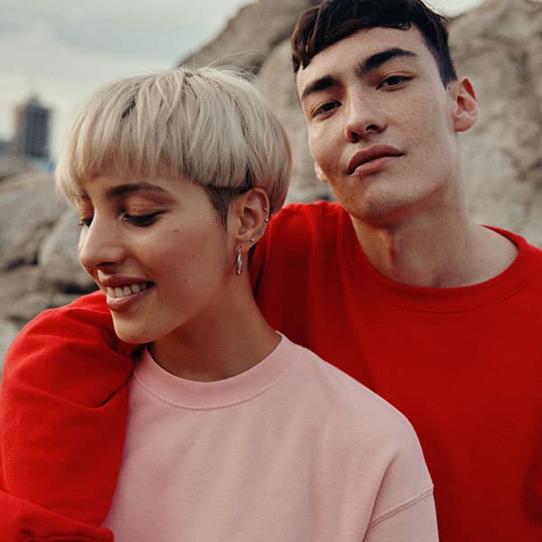
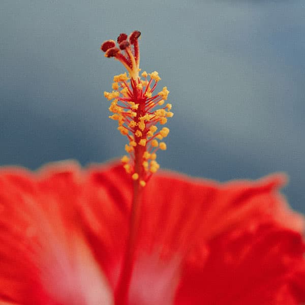
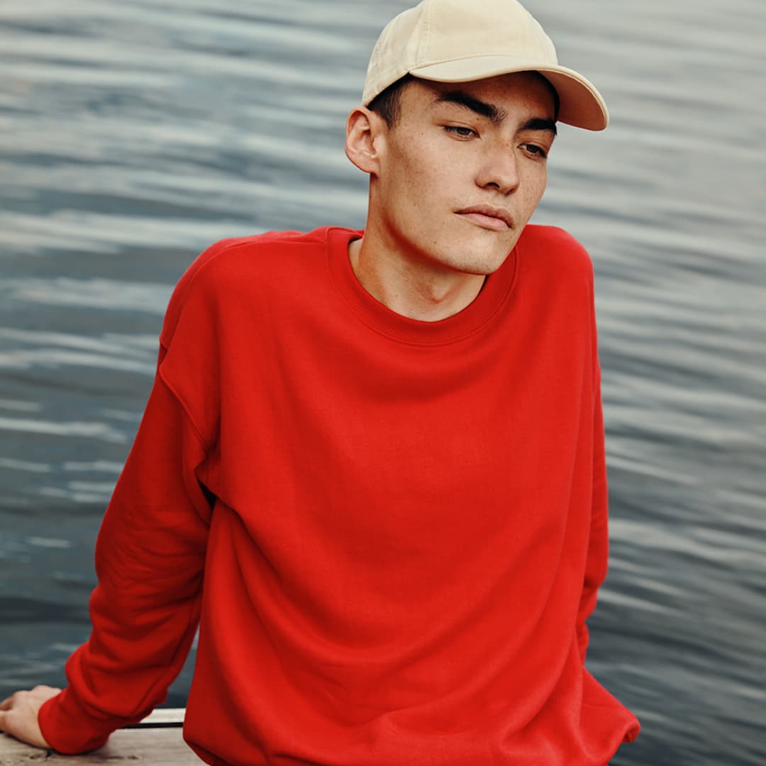
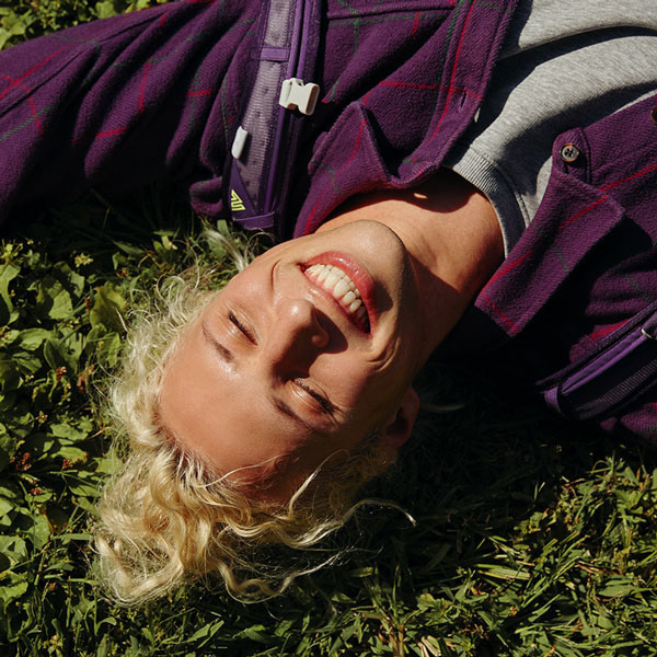
Digging into brand truths, we decided to focus on the untapped market, rather than trying to steal market shares. With Rise scoring 46% as best-tasting, we decided to present it as the perfect "introduction" to Kombucha. Where others tried to educate consumers about the health benefits of this drink, we "played it big" by transcending the category. We revised how we looked, talked and behaved to deepen our relation with culture and offered people a twist on flavour stories. We achieved this through a unique and contemporary lens that would resonate with potential consumers: moods = flavours. This setup was the perfect springboard to create a rich and evocative platform for Rise's US introduction.


Credits
Creative Direction Ludwig Ciupka
Charlène Sepentzis
Charlène Sepentzis
Concept & 3D Art Direction Hugo Boesch
Photo Art Direction Lian Benoit
3D Artist Jean-Michel Simard
Graphic Design Maude Turgeon
Simon Roy
Simon Roy
Production Joëlle Binet
Account Manager Guillaume Savard
Photography William Arcand (L'Éloi)
Styling Izabel Soucy (Teamm Mgmt)
MUA Alper Sisters (Teamm Mgmt)
Food Styling Daniel Raîche
Videography Brokenwood
Color Grading Raphael Laflamme
Models Ricky (Faces Mgmt), Gabriella, Damian (Folio), PierLoup (Folio), Ajwa, Ariadna
VP Marketing Ron Szekely
Next project
Next project
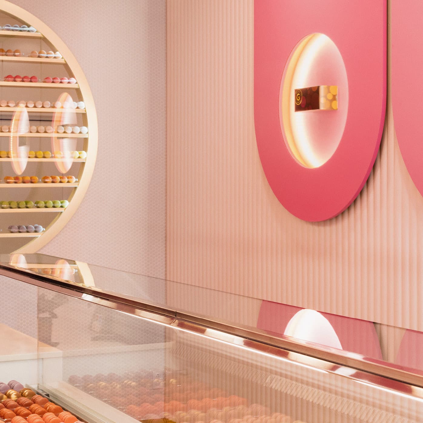
Point G
Point G
Point G
0