Tux Creative House
[ Close ]

Sunski

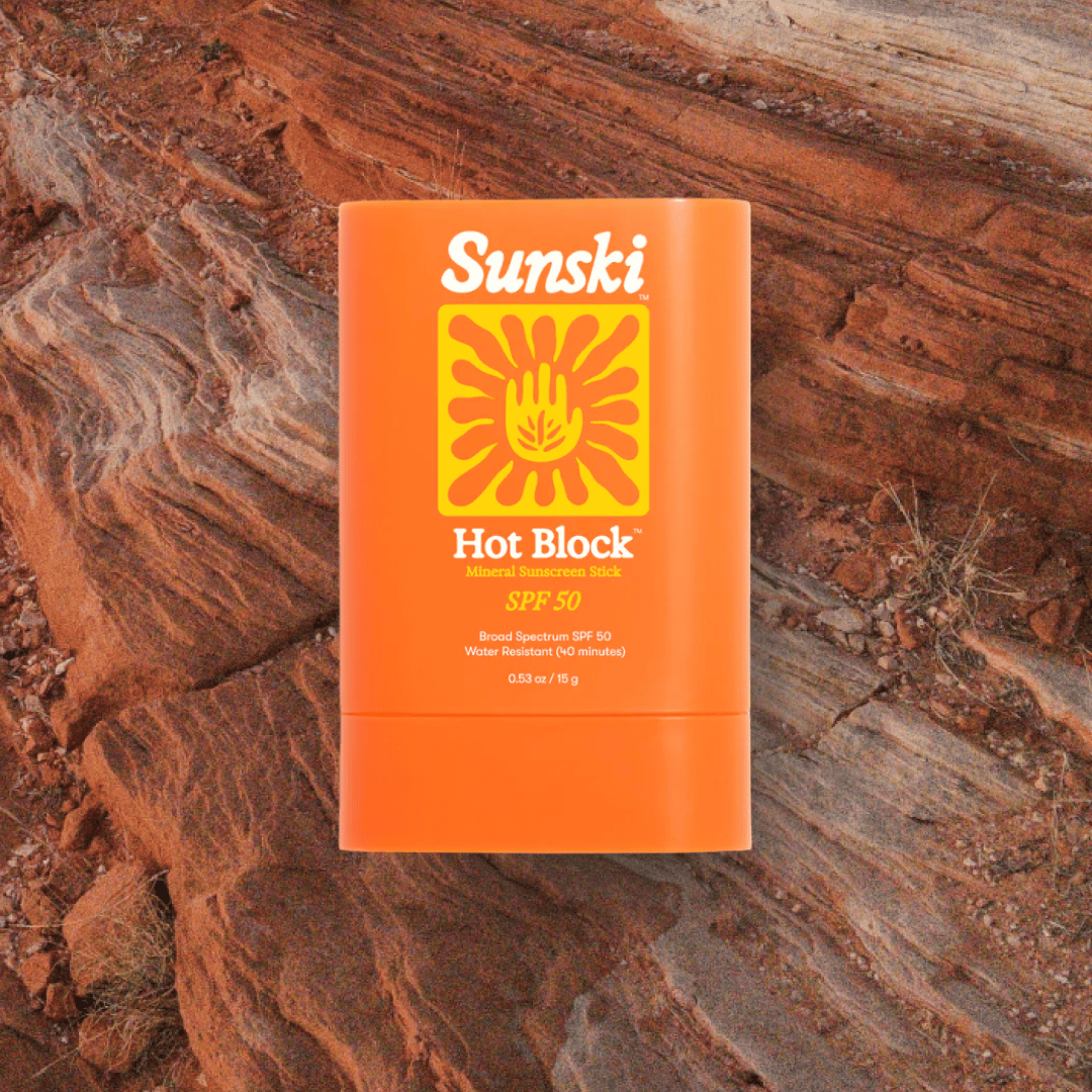
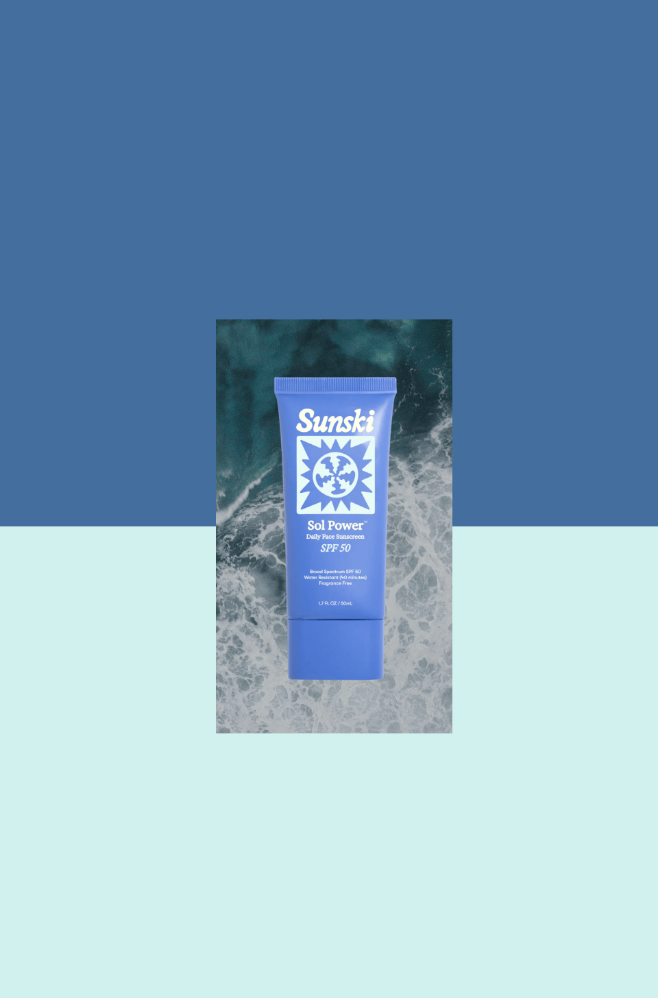
Sunski came to us with the ambition to evolve from a growing sunglasses business into a broader sun protection brand. Our challenge was to create an SPF product from the ground up and build a brand world strong enough to put Sunski on the map in a crowded suncare category.  

Next slide

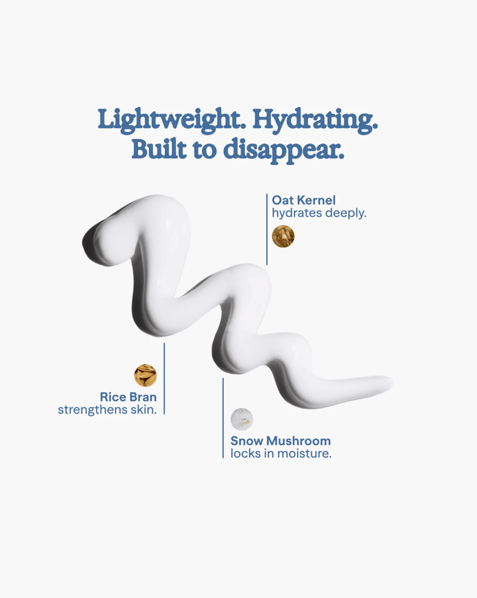
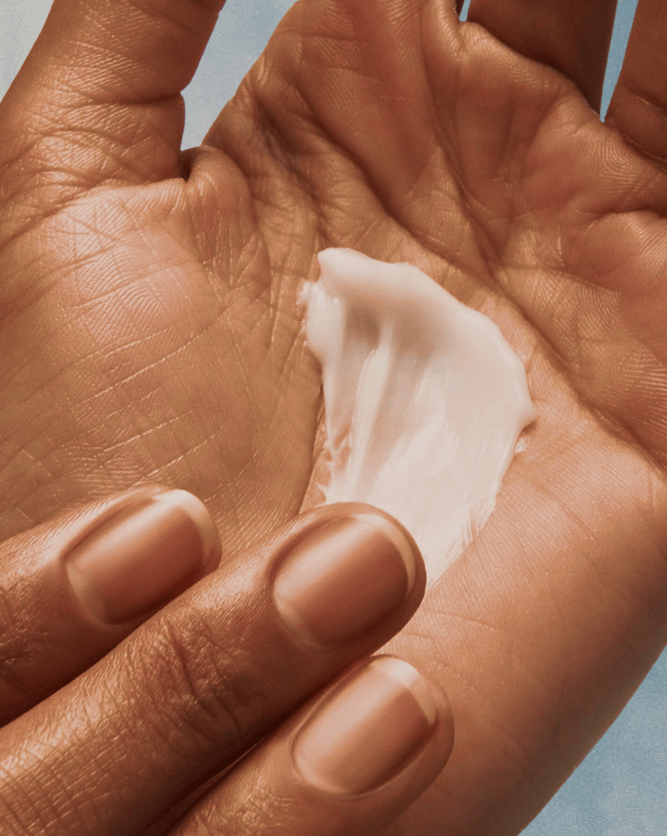
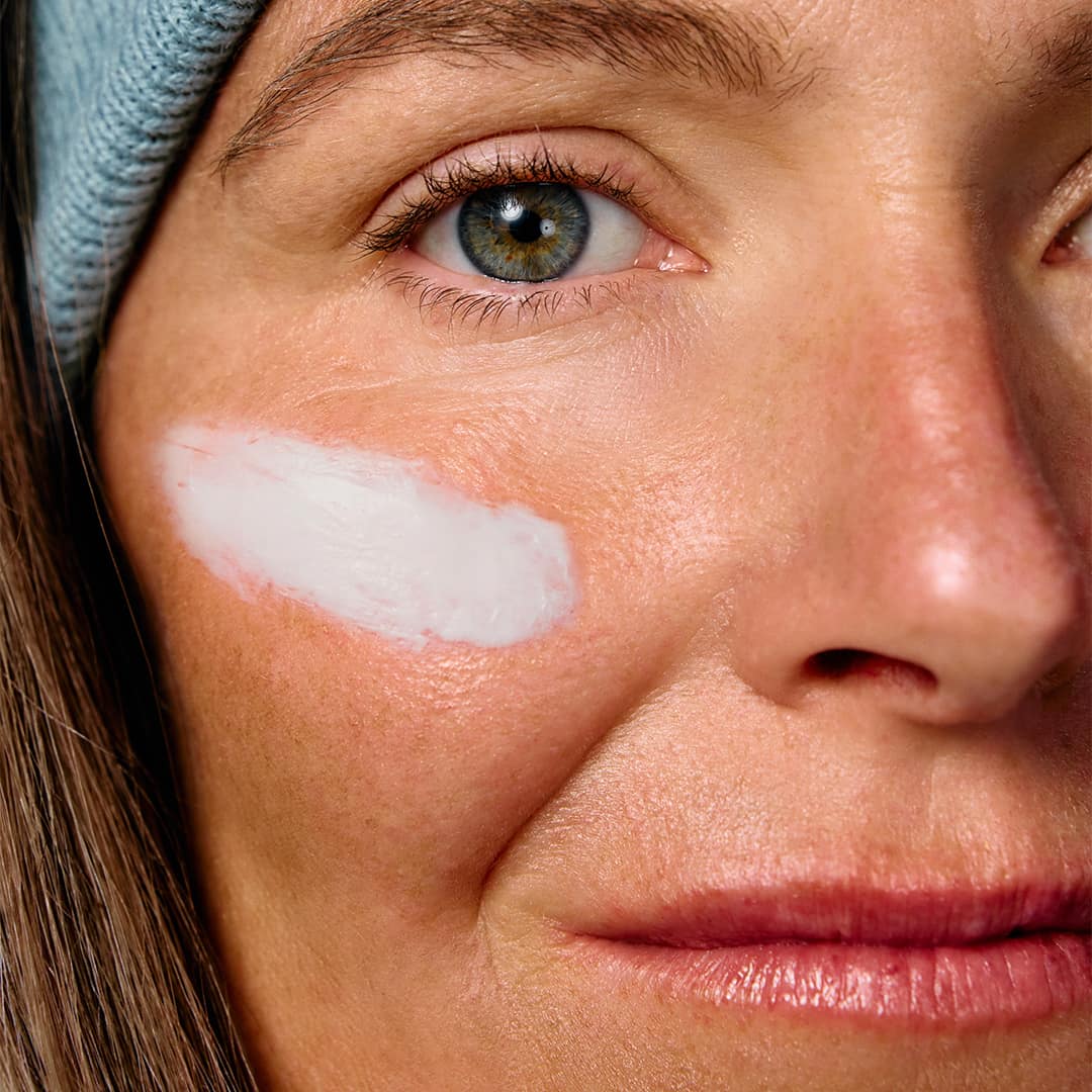
We began by working closely with Sunski’s community to understand what Outdoor Adventurers were missing from SPF. In a category split between eco, nostalgic, and trend-driven players, we uncovered two product truths that mattered most: sunscreen had to be slather-worthy and lickety-quick to absorb. The opportunity was to make SPF feel less like a chore and more like an invitation to go outside.
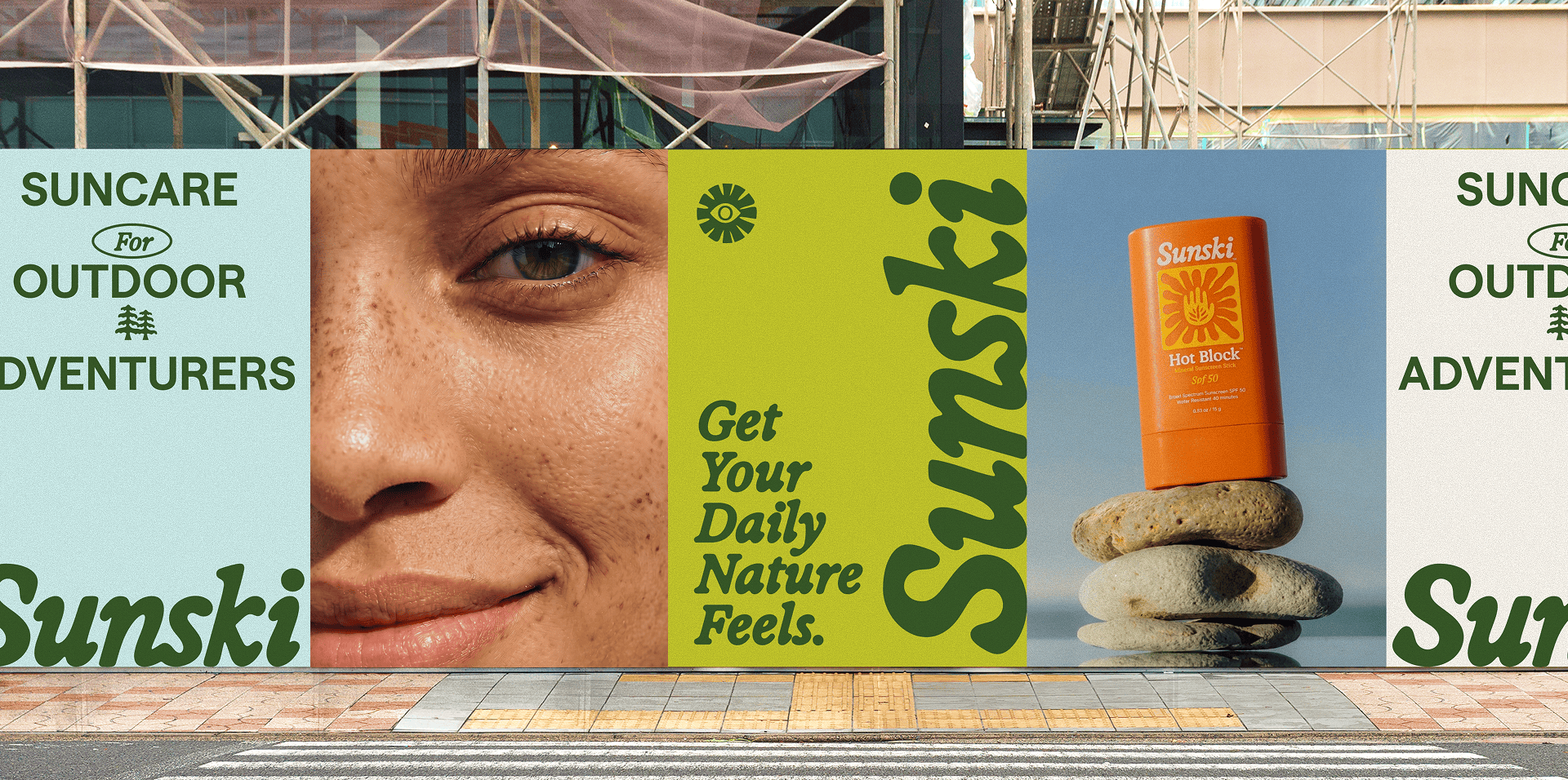
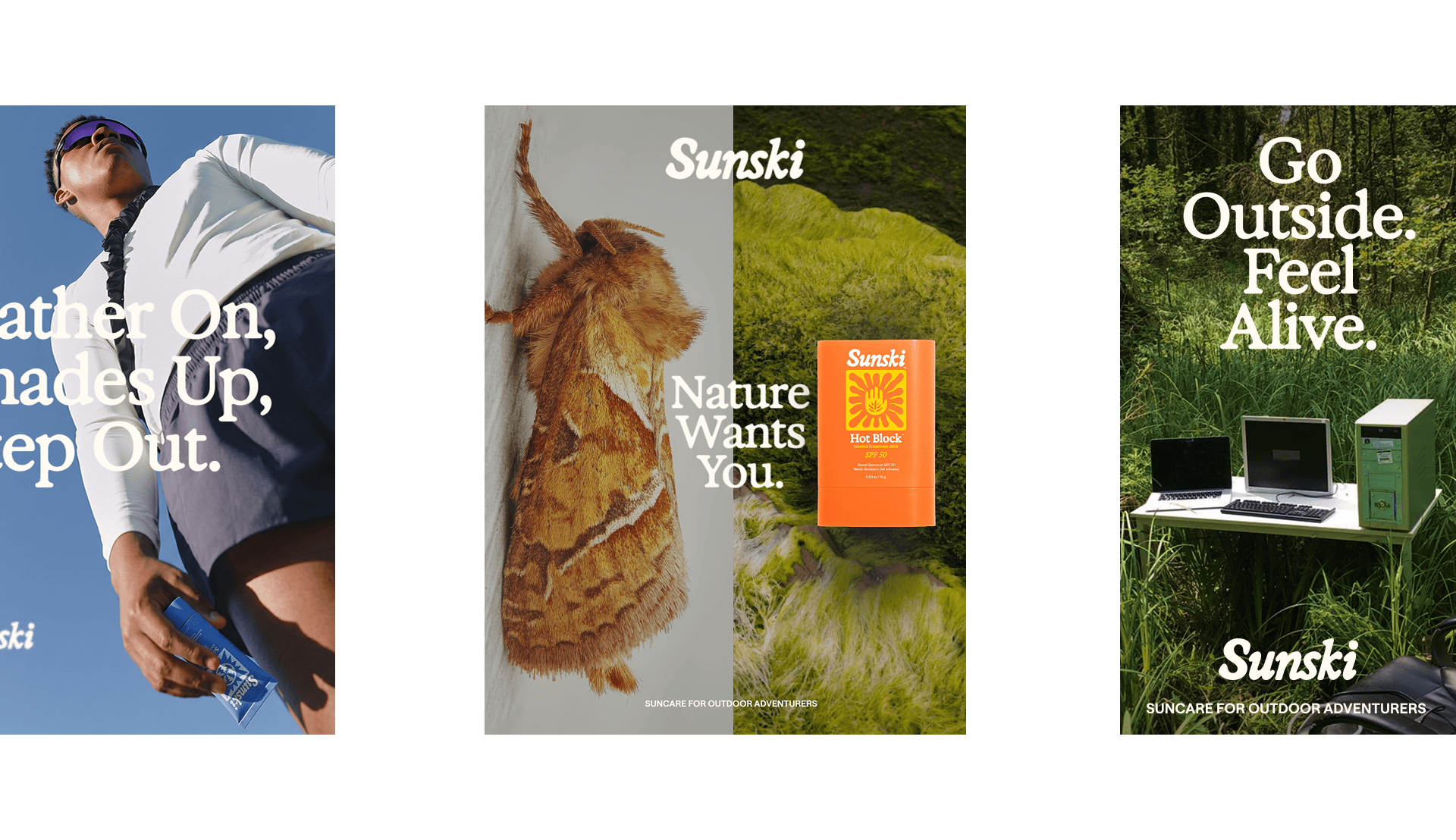
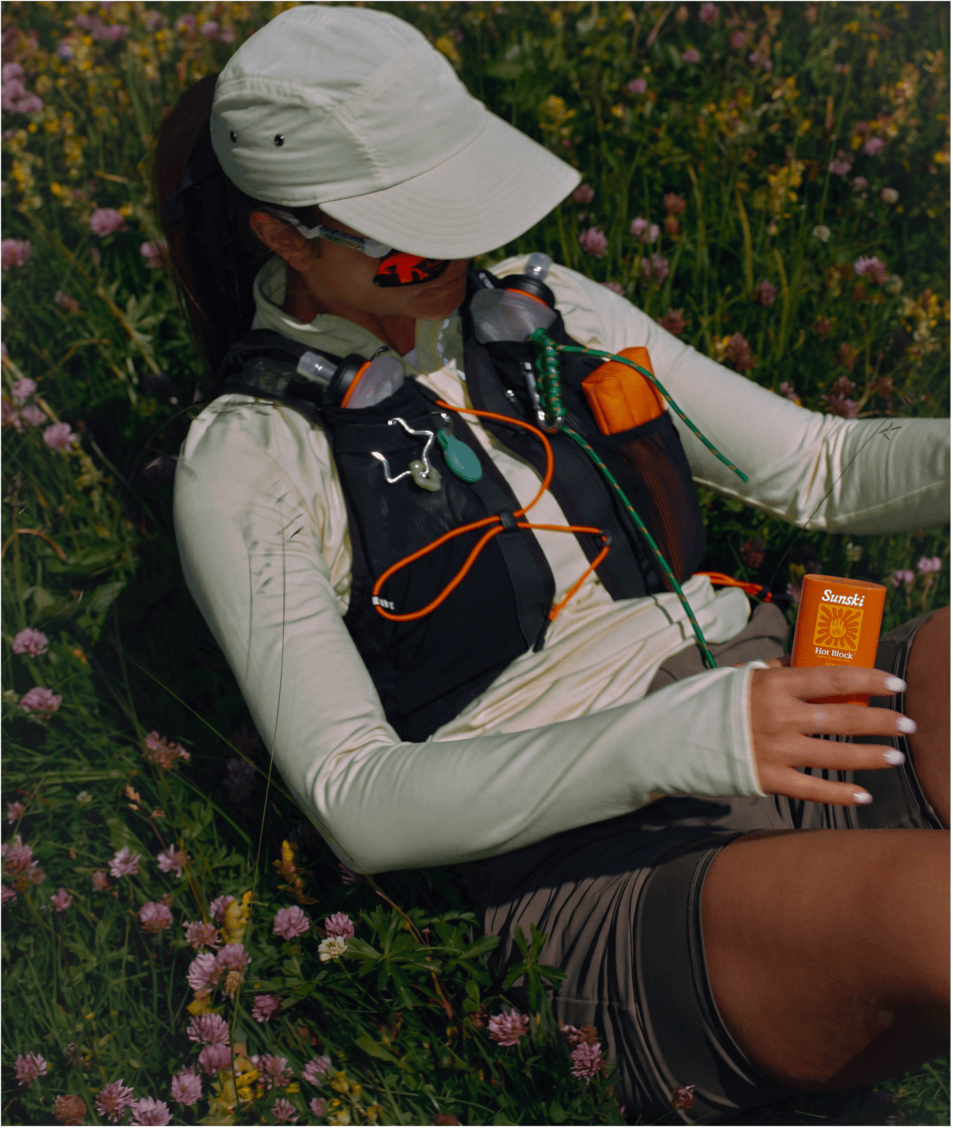
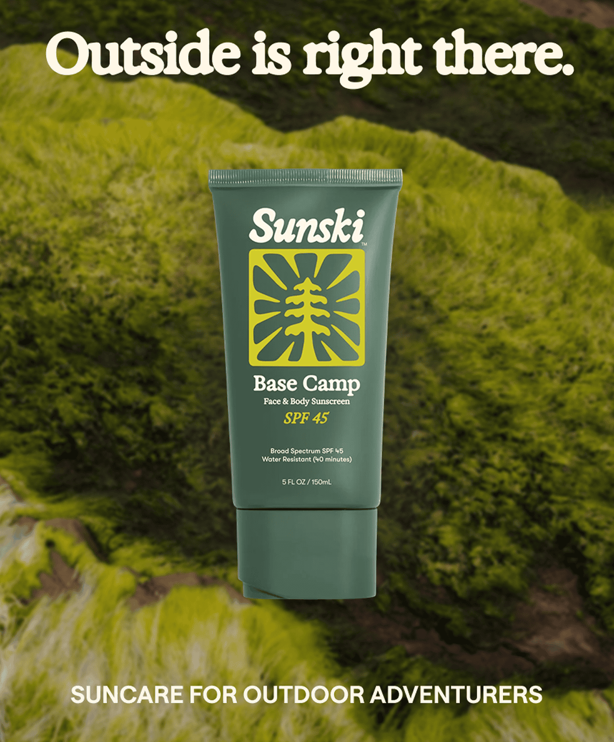
From a brand perspective, we saw that suncare was dominated by the same codes: beach, leisure, and escape. Sunski had a different point of view. The brand was not about basking in the sun; it was about adventuring in nature. That led to a positioning built around selling more outside, not more sun.

THE IDEA

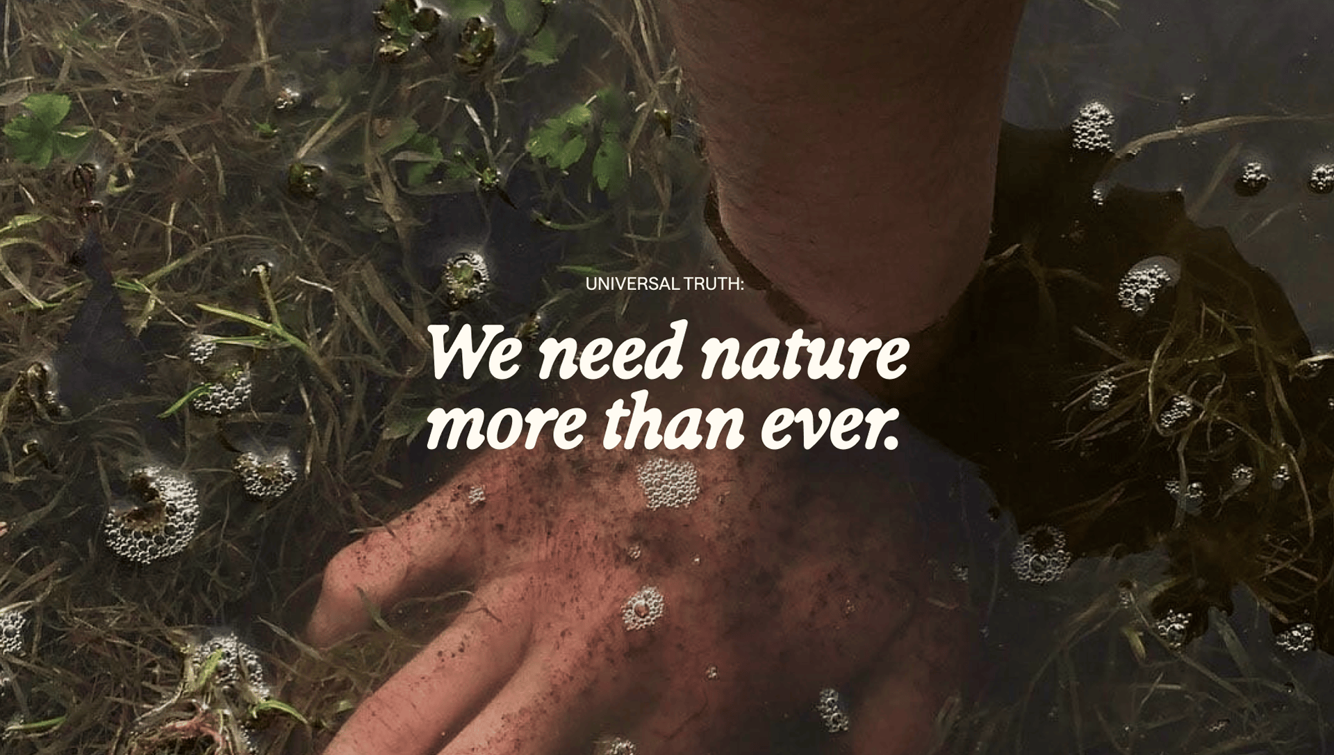
We rooted the brand in a modern contradiction: humans were built for the outdoors, but lately we’ve mostly been found hunched over tiny glowing rectangles. Sunski SPF became an antidote to the digital dystopia, a daily ritual and reminder to step away from the online world and reconnect with the natural world.
This idea shaped the entire creative system. Rather than frame SPF as functional protection, we made outside feel like pure pleasure. The art direction was designed to seduce people into nature through the sensoriality, warmth and joy of being outdoors.

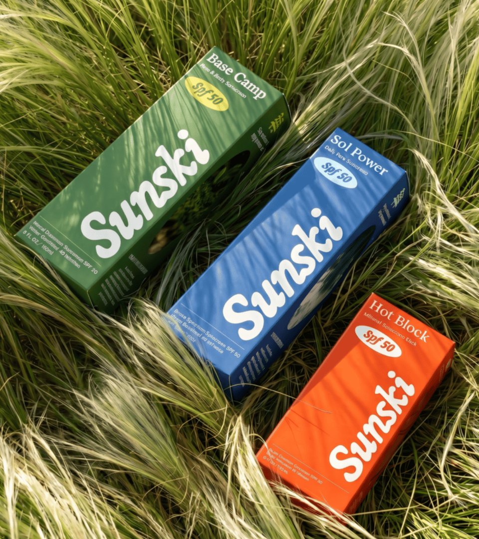
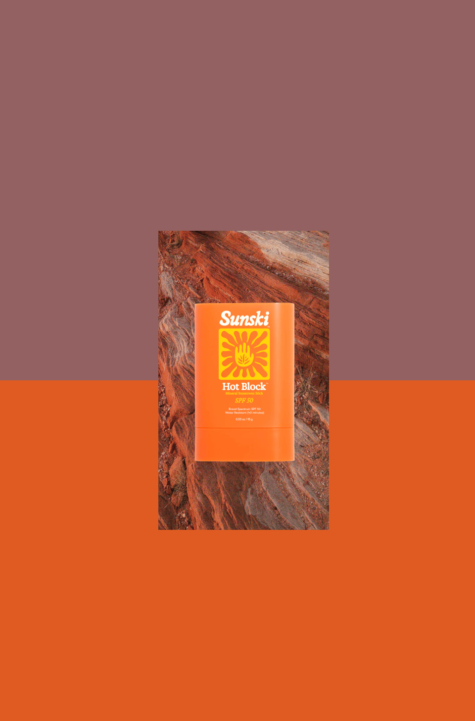
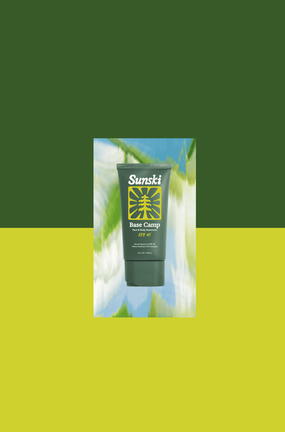
To keep SPF feeling fresh year-round, we moved beyond generic beach imagery and tapped into California’s geographical diversity: desert, lake, coast, lush forest, sun, snow. This gave Sunski a richer brand world and made SPF feel relevant well beyond summer, creating reasons to buy across the calendar year.

ILLUSTRATION

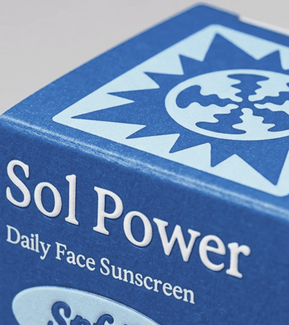
A core visual element of our brand system is our totems, hand-drawn by our team and serving as visual manifestations of our purpose. Each totem was assigned to a product story, executed in a playful, screen-printed poster aesthetic.

Credits

Client Partnership Director Emma Olender
CCO Ludwig Cuipka
VP, Creative Chelsea Matthews
Senior Art Director Mariana Serrano
Strategy Director Stacy Gagnidze
Copywriting Stacy Gagnidze
Senior Client Partner Jeff Rogers
Co-Founder Tom Steward
Co-Founder Michael Charley

Next project

Next project

First Aid Beauty — Face Winter

First Aid Beauty — Face Winter

First Aid Beauty — Face Winter

0