Tux Creative House
[ Close ]

Dermablend

Menu

Since ‘going viral’ with our first campaign, our relationship with Dermablend has gone from strength to strength as we helped transform not only their brand image, but their business.  Tell me more

Next slide
A MUCH-NEEDED BRAND RENOVATION.

In the vast majority of stores where Dermablend is sold, its dermatologist-approved heritage pushed the coverage brand to sit uncomfortably in the active cosmetics section (creams), rather than being sold alongside its competitor makeup brands.

Because of this, dermablend professional, with its heavy black packaging, was perceived as a niche coverage brand, meant only for qualified makeup artists wanting to cover severe skin concerns. With the rebranding, we turned this situation to our advantage and made the brand a destination with a unique and modern approach to coverage. With the rebranding, we turned this situation to our advantage and made the brand a destination with a unique and modern approach to coverage.

Powerful transformations. Powerful Stories.

If we learned anything working with Dermablend during the past few years, it’s that their products deliver impactful results, which often end up changing people's lives. Those two facets of the brand come together in a simple yet effective new brand tagline: Powerful Makeup For All. Our intention is purposefully to employ an overused category notion (the word "powerful"), as only Dermablend can truly deliver on its promise. The new brand imagery aims to own the typical before / after comparisons, but in a new, dramatic and empowering way.

Not only is the brand broadly recommended by dermatologists, but it was also created by them. We saw this as an opportunity to set ourselves apart from the competition and give people a reason to believe. So we brought it back.

To support this claim, we reinvented the way we communicate our product benefits. We created a table system that would feel "technical", but that would allow consumers to easily navigate and compare the brand’s complex product portfolio. The visual layout resembling the already understandable nutrient table made it a familiar shopping experience. Dermablend’s USP being coverage, we made it a standard to put forward our high pigment concentrations. This graphic approach gave a ‘functional’ and modern feeling to the brand and supported our new desire to provide straightforward expert guidance.

If we learned anything working with Dermablend during the past few years, it’s that their products deliver impactful results, which often end up changing people's lives. Those two facets of the brand come together in a simple yet effective new brand tagline: Powerful Makeup For All.

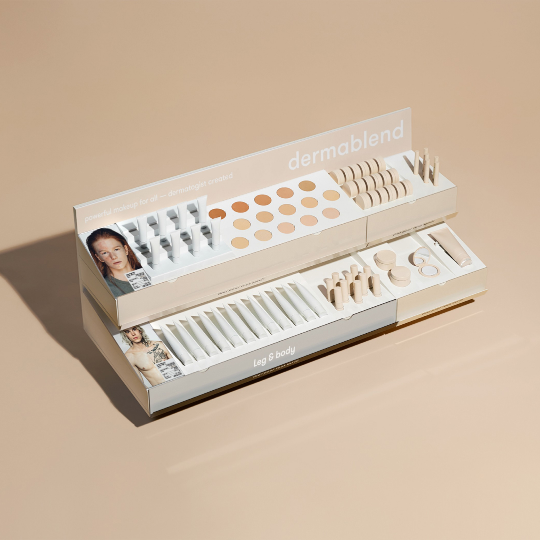
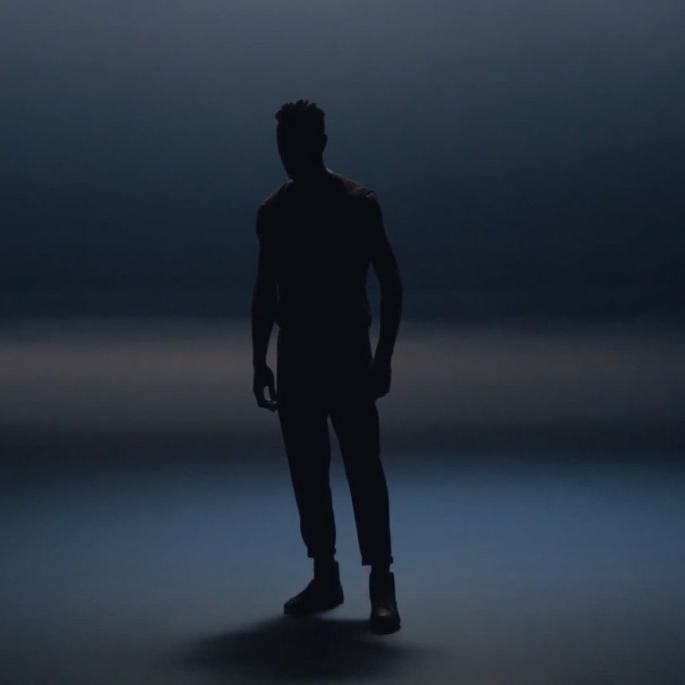
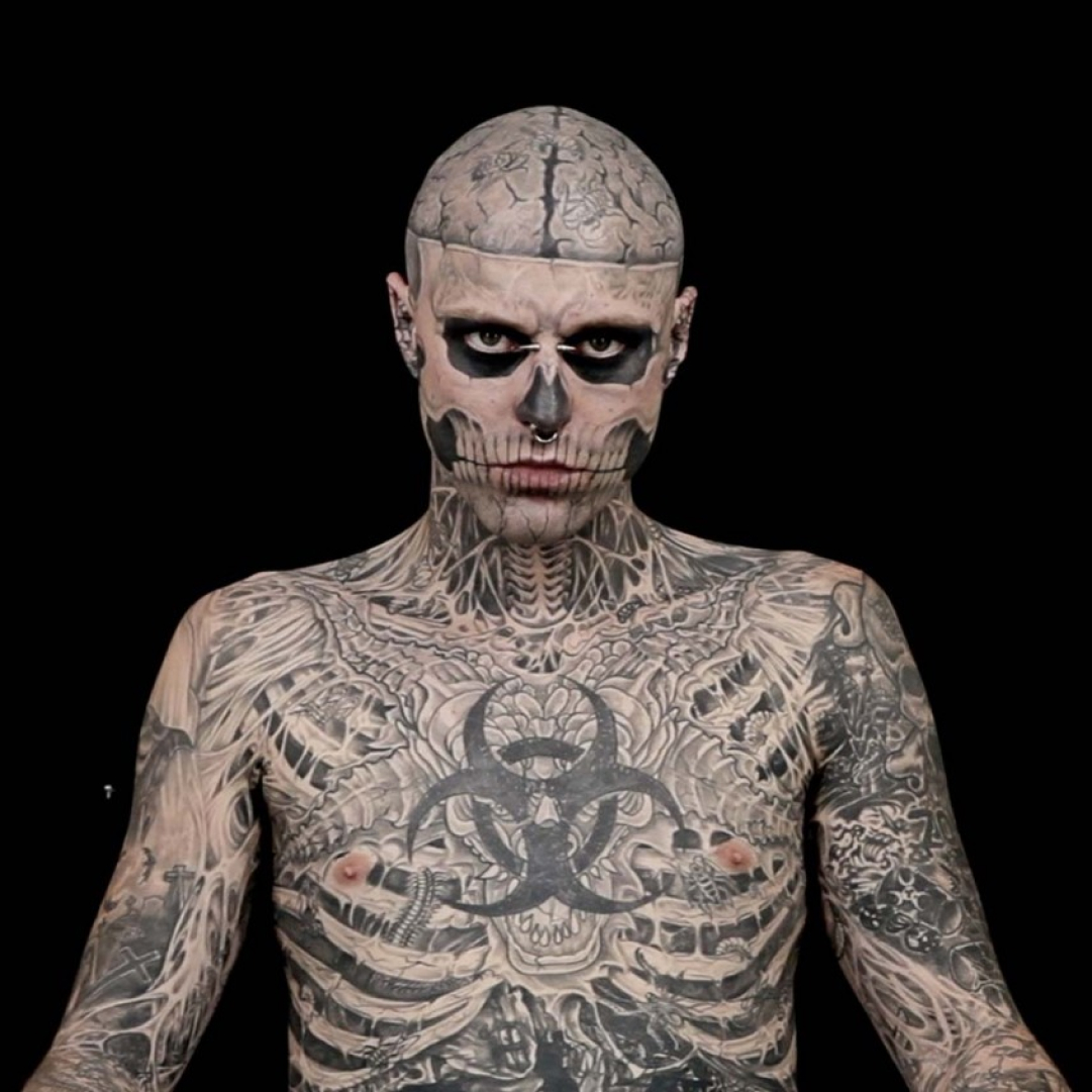
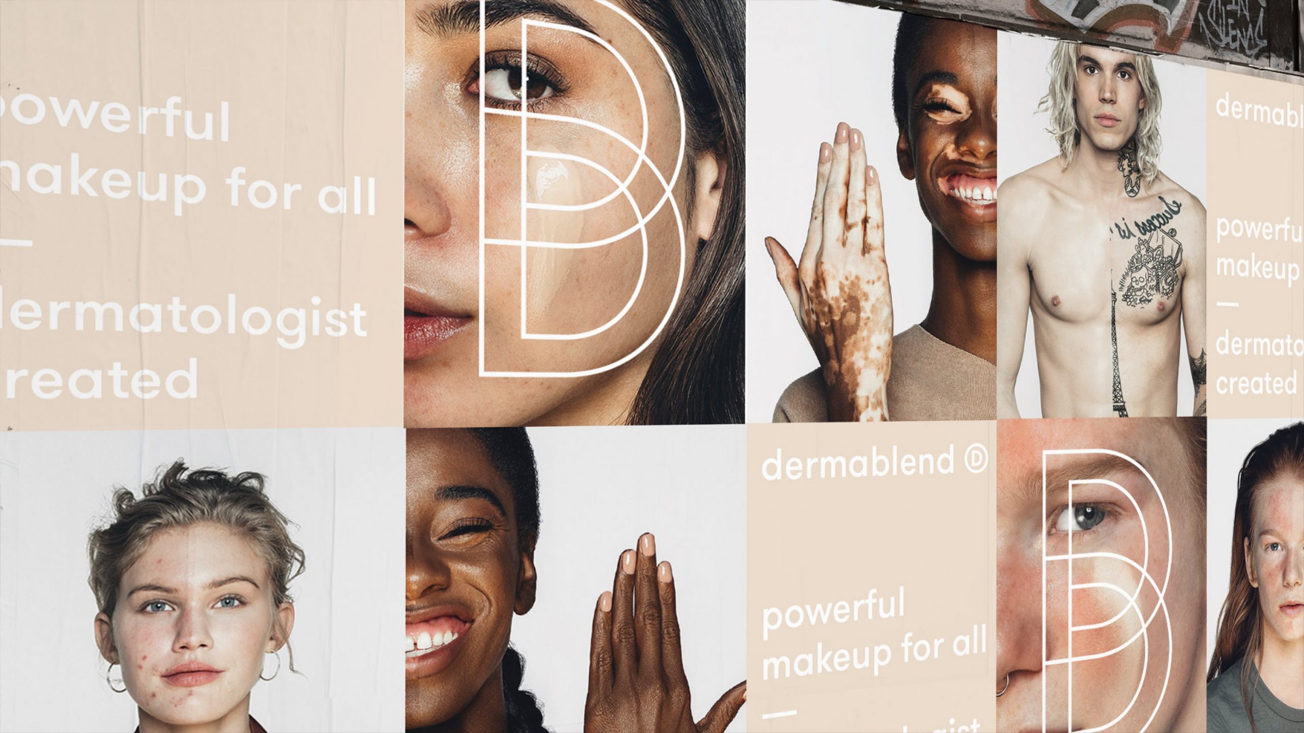
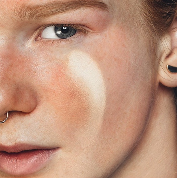
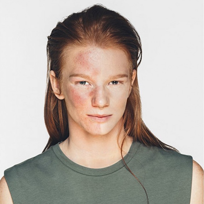
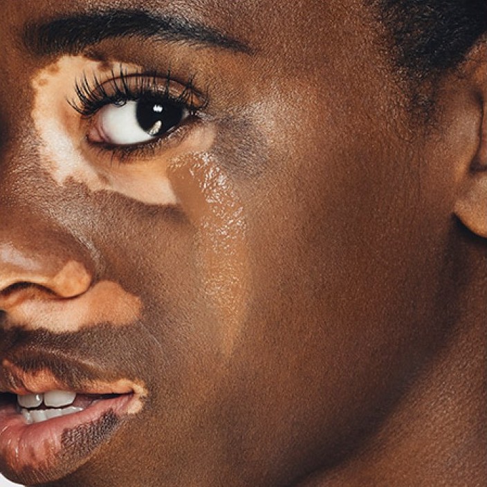
Go Beyond The Cover, 2011

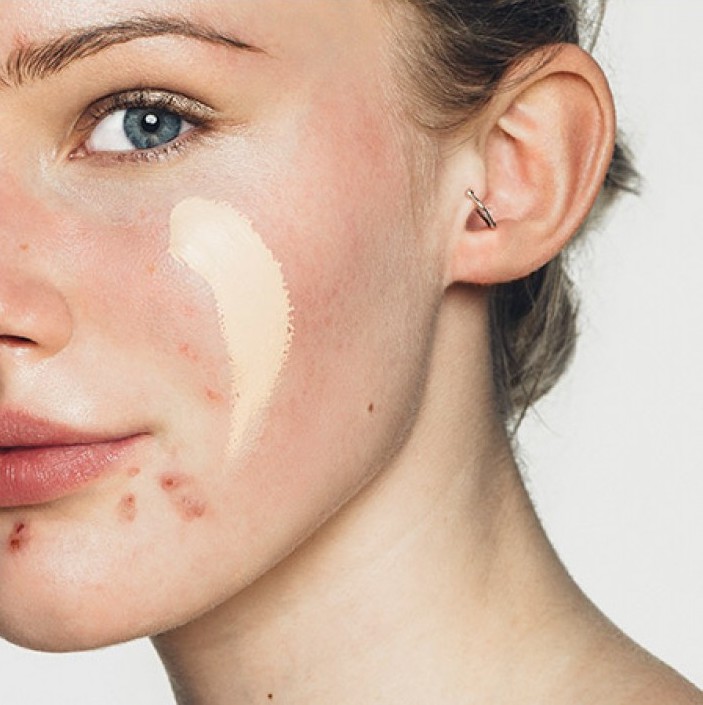
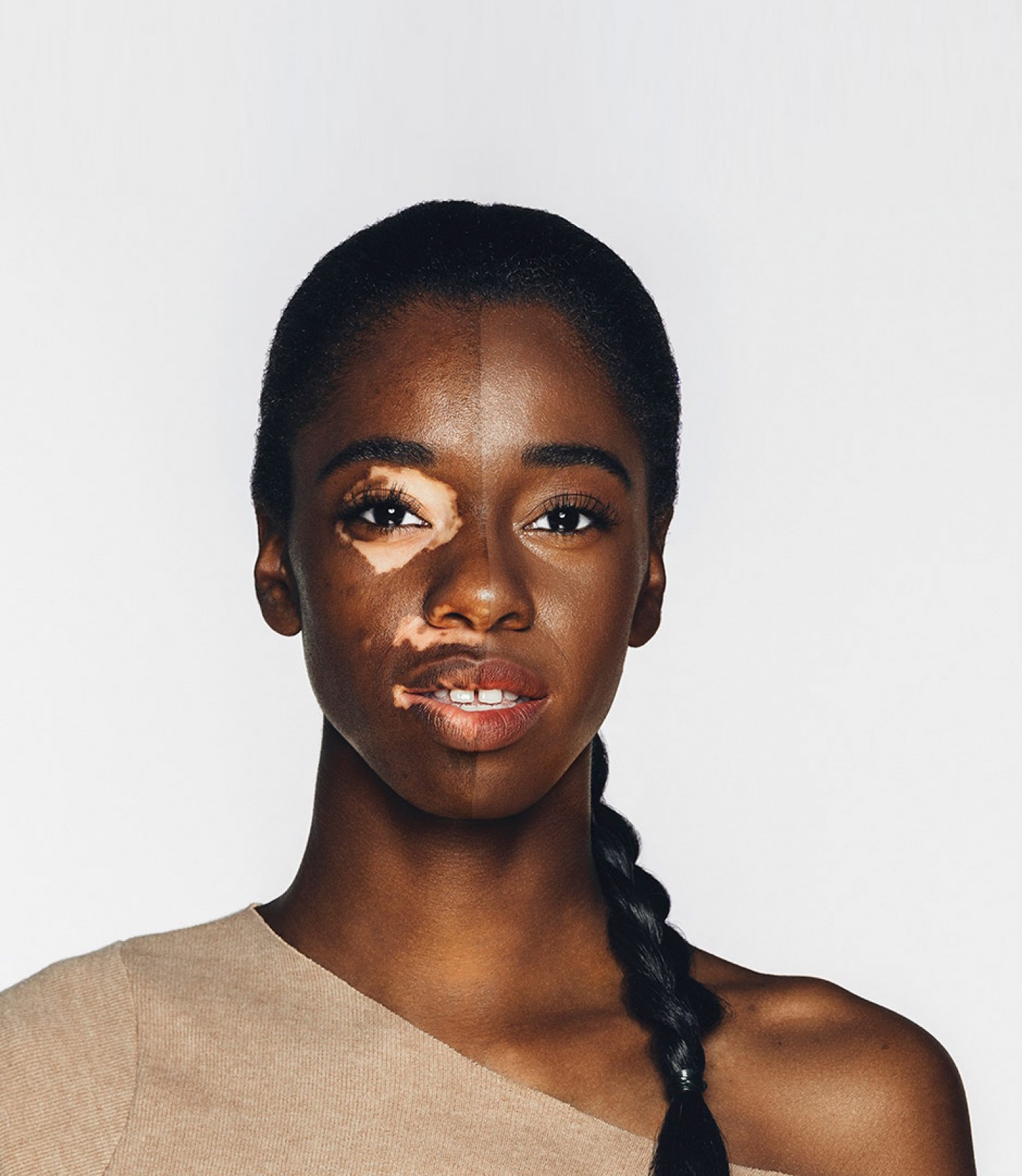
Our first Dermablend campaign embraced the viral potential of digital video with a dramatic product demonstration featuring Zombie Boy. With 34 million views generated on YouTube, this video was the second most-viewed ad in the world that year. This campaign won countless awards, including a Cannes Lion, a Webby Award, two Bees, one IAB and a CRÉA.

Camo Confessions, 2014

Creating greater brand awareness than we could have ever hoped for, we followed this up with an engagement campaign called Camo Confessions, which focused on real people using the products. The campaign generated 14 million views and over 2.3 million views from UGC alone, and was named one of the top 10 ads of the year by AdWeek. The campaign also won multiple awards, including a Clio Image Award, a New York Best Advertising award, and a Davey.

Go Beyond The Surface, 2016

The third chapter in this series again featured real people, but with a newfound confidence. The manifesto-style approach not only celebrated the power that Dermablend provides people with, but also reaffirmed the brand as a market leader in highly transformative coverage.

A fresher, more carefree tone.
Not only did we refresh the visual imagery to make it lighter, but we also shifted the brand’s tone of voice to make it more acceptant of skin concerns and suggest product "ease-of-use". How-to videos were created in a short, ‘snackable’ format to counteract the ‘professional-only’ stigma and make the application process more accessible.

We also started to reimagine how all assets would come together in a physical environment, and how this new vision would feel in a structural form. The goal was to conceive a concept that would withstand time and and always feel on-trend while being scalable across the world. We created a modular showcase for the brand that could accommodate different portfolio offerings for specific store needs and international markets.

Credits

Creative Direction Ludwig Ciupka
Art Direction Laurie Castilloux
Production Christina Meunier
Client Partnership Barbara Caselli
Editing Jean-Michel Simard
Photography Nastia Cloutier-Ignatiev
General Manager Malena Higuera
General Manager (2016) Soniya Sheth
Marketing Director (2010) Renée Mininni

Next project

Next project

Milk & Bone

Milk & Bone

Milk & Bone Day Dream - Milk & Bone Day Dream - Milk & Bone Day Dream - Milk & Bone Day Dream

Plan
Make
Launch
0